“Hello World!” as my automatic introductory post so aptly put it. This semester I have signed myself up for a class on the history of graphic design, which is helping to discipline me to create a blog by offering a shiny orange carrot in the form of a hefty 50 points of extra credit! It seems almost too good to be true, and I am very happy for the push. Each week, we are instructed to create “Field Journal” about a topic chosen for us in the class. This week, it was to look through the pictures in our textbook and comment on what stands out or our overall perspective about the topics and types of artwork covered in the book. Our textbook, “Meggs’ History of Graphic Design”, offers quite an extensive view of the field of graphic design, from pre-history cave drawings up through digital artwork created in 2005.
I saw a lot of new things looking through the textbook, but also a lot of familiar pictures and artists that I have studied in my previous art history courses. It is funny to see how much the fields of fine art and graphic art overlap. One of my old painting teachers at LA Valley College, Carol Bishop, used to describe my work as having a “graphic design quality”. My paintings were primarily flat, not quite naturalistic but more playful. I paint in an expressionistic way, and I am a colorist. To me, this is one way to define “graphic design” in a medium largely associated with fine art. I also think that many abstract artwork can be considered graphic design, especially if it is carefully laid out. This also brings in page layout as graphic design, and with that comes text and typography. These days, the lines are blurred between fine art and graphic design, which makes this class becoming more and more relevant to all art majors, and not just graphic designers.
I think the main difference, though, is that graphic design is primarily made to communicate information, facilitate learning, and invite a specific pre-calculated reaction with the viewer based on many factors that the artist is assuming apply to the viewer or reader. It has been stressed many times in my previous art history classes that fine art, however, is most often left for the viewer to draw their own conclusion from, to project themselves onto and get their own individual interpretation of. Many, if not most, fine artists want this sort of open-ended quality in their art work. It is what helps to keep it current, to keep it alive, and to keep people postulating about it long after the artist themselves is gone. It is something interesting to look at and to study. I think that the majority of graphic design is made for a specific audience at a specific point in time to evoke a specific reaction, whether it is to buy a product, communicate the theme or the importance of a written tract, or evoke feelings through propaganda. It’s why companies are constantly changing product packaging, why events have decorated fliers, or why books have covers.
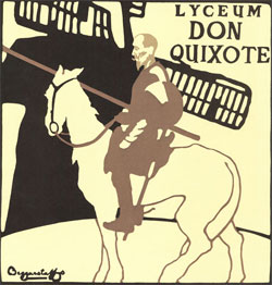
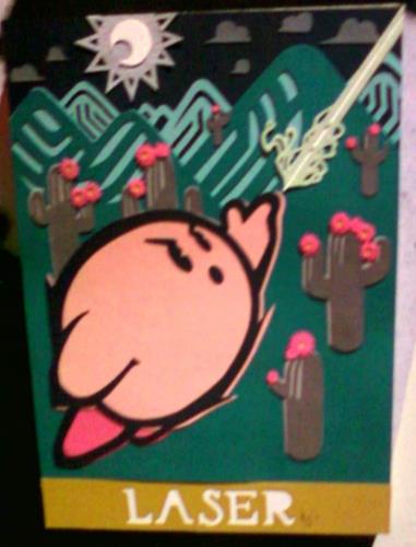
All of that being said, there were a few pieces that made me pause a little longer than normal. The image 14-3, a poster for Don Quixote by the Beggarstaffs, really held my attention. I love pictures that are made from cut picture shapes. I love the simplicity and overlapping and the inky organic quality that emerges from having one color plane of an image cut from a single sheet of paper. I love the flat, clean, graphic quality. It reminds me of some work I saw recently when I went to the Super iam8bit show in LA. One artist did a series of 9 different Kirbys all in cutout paper. Here’s a photo of my favorite. I found it very inspiring, and they look even more neat in person.
Another picture I really enjoyed was image 21-30, a poster for Anna Christie by James McMullan. I love how the colors of the watercolor paint blend together and push up against one another to create the sense of lighting and dimensionality in the image. At first glance I kind of overlooked this picture since it is bottom heavy, and my eyes were primarily drawn to the high contrast between the lively lucid red lines against a pale background, but after reading the description I gave it a second look, and I then found the face. The highlights are magical, the shadow denotes the mood coming through her eyes, and the position she is sitting in makes me want to know more about her, so I searched the picture trying to find out more.
I hope that I have provided something engaging or thought-provoking for you here today. Please feel free to leave a comment.


